The Calendar component is an implementation of FullCalendar (version 7) as a Perspective component. It supports multiple calendar views, event display and interaction, drag-and-drop scheduling, and built-in popups for creating and editing events.
Two optional built-in popups are available but disabled by default. The Event Popup appears when an event is clicked and can optionally allow editing. The Create Event Popup appears when a date or time block is clicked. Neither popup modifies the calendar directly — all changes are surfaced through component events for handling in scripts.
The Calendar component works alongside the External Event Box component to support drag-and-drop scheduling from an external list of events onto the calendar.
Properties
| Name | Description | Property Type |
|---|
| editable | Allows events to be dragged to new times and resized. | boolean |
| selectable | Allows selecting a single date or a range of dates. | boolean |
| selectedDate | When selectable is true and a selection is made, reflects the current selection with start and end string properties. | object |
| selectedEvents | The currently selected events. A single click selects an event (replacing the current selection); Ctrl/Cmd or Shift-click toggles individual events. Can also be written to programmatically to drive the selection. | array |
| defaultView | The initial calendar view displayed when the component loads. Default is dayGridMonth. | string |
| currentView | The currently displayed view. Writing to this property will change the view. If an invalid view name is written, the component will reset to the current view. Valid options are: dayGridMonth, dayGridWeek, dayGridDay, dayGridYear, timeGridWeek, timeGridDay, listYear, listMonth, listWeek, listDay, multiMonthYear. | string |
| events | An array of event objects to display on the calendar. See Event Object Properties below. | array |
| longPressDelay | For touch devices, the time in milliseconds the user must hold down before an event becomes draggable or a date becomes selectable. Default is 1000. | integer |
Event Object Properties
Each item in the events array supports the following properties. Only start is required.
| Name | Description | Property Type |
|---|
| id | A unique identifier for the event. Defaults to an empty string if not provided. | string or number |
| groupId | Events sharing the same groupId will be dragged and resized together. | string or number |
| title | The text displayed on the event. | string |
| start | Required. When the event starts, as a parseable date/time string. If no end is defined, the event defaults to all-day on the start date. If start includes a time and end is omitted, the event duration defaults to one hour. | string |
| end | When the event ends. This value is exclusive — an all-day event ending on 2020-09-03 spans through 2020-09-02. | string |
| allDay | When true, the event ignores any time portion of start and end. | boolean |
| color | The background and border color of the event. | string |
| contrastColor | The text color of the event (foreground color that contrasts with color). | string |
| display | Overrides the display style for this individual event. Same options as eventDisplay.eventDisplayType. | string |
| editable | Overrides the component-level editable setting for this specific event. | boolean |
| startEditable | Whether the start date/time of this event can be changed by dragging. | boolean |
| durationEditable | Whether the duration of this event can be changed by resizing. | boolean |
| overlap | Whether this event is allowed to overlap other events when being dragged or resized. | boolean |
| ownerId | An identifier for the owner of the event. | string or number |
Example event object:
{
  "id": "1",
  "title": "Production Run A",
  "start": "2026-06-23T09:00:00",
  "end": "2026-06-23T11:00:00",
  "color": "#d40000",
  "contrastColor": "#ffffff"
}
Event Pop Properties
| Name | Description | Property Type |
|---|
| useEventPop | Whether the built-in popup for showing event details will appear when an event is clicked. | boolean |
| canEditEventOnPop | Whether the edit button appears on the built-in event popup. | boolean |
| canExportEventOnPop | Whether the event can be exported as an iCal object from the popup. | boolean |
| useCreateEventPop | Whether the built-in popup for creating events appears when a date or time block is clicked. | boolean |
Event Display Properties
| Name | Description | Property Type |
|---|
| eventDisplayType | Controls the default rendering style for all events. Options: auto (solid block for all-day/multi-day, dot for timed events in daygrid), block (always solid block in daygrid), list-item (always dot in daygrid), background (highlights background), inverse-background (highlights inverse background), none (not rendered). Default colors are set via theme.palette. | string |
| displayEventTime | Whether to show the start time on timed (non-all-day) events. | boolean |
| displayEventEnd | Whether to show the end time on events. | boolean |
| nextDayThreshold | The minimum time that must pass into a day for a spanning event to be rendered on that day in daygrid view. Format: HH:mm:ss. | string |
| eventOrder | Determines display order when events occupy the same space. Uses event property names; prefix with - for descending order. Default is start,-duration,allDay,title. | string |
| slotEventOverlap | Whether timed events in TimeGrid view visually overlap. | boolean |
Current Calendar Date Properties
| Name | Description | Property Type |
|---|
| date | An ISO 8601 string (YYYY-MM-DD) of the current displayed date. Writable when dateIsReadOnly is false. | string |
| dateIsReadOnly | When false, writing to date changes the displayed date. | boolean |
| week | The ISO week number of the year (readonly). | number |
| displayDateStart | The first visible date on the display. In month view this may not be the first of the month (readonly). | string |
| displayDateEnd | The last visible date on the display. This value is exclusive (readonly). | string |
| currentDateStart | The first date of the range the view represents (readonly). | string |
| currentDateEnd | The last date of the range the view represents. This value is exclusive (readonly). | string |
| title | The title string currently generated by the calendar (readonly). | string |
Date and Time Display Properties
| Name | Description | Property Type |
|---|
| firstDay | The first day of the week in day grid views. 0 = Sunday, 1 = Monday, etc. | number |
| minTime | The earliest time displayed in time grid views. Format: HH:mm:ss. Default is 00:00:00. | string |
| maxTime | The latest time displayed in time grid views. Format: HH:mm:ss. Default is 24:00:00. | string |
| navLinks | Whether to make parts of the calendar (e.g., date numbers) into links that navigate to related views. | boolean |
| weekNumbers | Whether to display week numbers when possible. | boolean |
| useISOWeekCalc | Whether to use ISO week numbers rather than localized week numbers. | boolean |
| weekLabel | The label displayed before the week number. Default is W. | string |
| nowIndicator | Whether to show a line indicating the current time on time grid views. | boolean |
| slotDuration | The duration of each time slot in time grid views. Default is 00:30:00. | string |
| slotLabelInterval | The frequency at which time slot labels are shown. Useful when slotDuration is small but you only want labels every hour. | string |
| expandRows | Whether rows expand to fill the full height of the view when they don't naturally fill it. | boolean |
| snapDuration | The time interval at which a dragged event snaps to the time axis. Default is 00:30:00. | string |
| slotLabelFormat | The format of the time labels in time grid views, as a Date Format object. See FullCalendar date formatting. | object |
| allDayText | The text shown on the all-day slot in time grid views. Default is All day. | string |
| weekends | Whether to display weekends on the calendar. | boolean |
| hiddenDays | An array of integers representing days to hide. Days are indexed from 0 (Sunday) to 6 (Saturday). | array |
| businessHours | Highlights business hours on the calendar. Can be an empty object {} to disable, or an object/array of objects with daysOfWeek, startTime, and endTime. Example: {"daysOfWeek": [1,2,3,4,5], "startTime": "09:00", "endTime": "17:00"}. | object |
| timeZone | The time zone of the calendar. Options: local (browser time zone), gateway (pulled from the Perspective session), custom (uses local but allows a custom now), or a time zone identifier string such as America/New_York. | string |
| now | When timeZone is set to custom, sets the current time as an ISO formatted date string. | string |
| Name | Description | Property Type |
|---|
| header | Configures the header toolbar with left, center, and right string properties. Each is a comma-separated list of toolbar elements. Set to false to remove the header entirely. Available elements: title, prev, next, prevYear, nextYear, today, or any valid view name. Spaces between commas add gaps between buttons. | object or boolean |
| footer | Same structure as header. Configures the footer toolbar. Defaults to false (hidden). | object or boolean |
| buttons | An object with a key per toolbar button name, each configuring that button's appearance and behavior. See Toolbar Button Properties below. Configurable buttons are: today, prev, next, prevYear, nextYear, dayGridYear, dayGridMonth, dayGridWeek, timeGridWeek, timeGridDay, multiMonthYear, listYear, listMonth, listWeek, listDay. | object |
Each button under toolbar.buttons supports:
| Name | Description | Property Type |
|---|
| text | The display label for the button. | string |
| hint | Tooltip text shown on hover. | string |
| className | A CSS class name to apply to the button. The psc- prefix is applied automatically — enter only the suffix (e.g., enter my-button, not psc-my-button). | string |
| isPrimary | When true, renders the button with primary styling. | boolean |
| display | Controls how the button content is rendered. Options: auto, icon, text, icon-text, text-icon. | string |
Popover Properties
| Name | Description | Property Type |
|---|
| dayMaxEvents | In dayGrid views, the maximum number of events to show per day before a "+more" link appears. Set to true to limit based on cell height. | number or boolean |
| eventMaxStack | In timeGrid views, the maximum number of events that stack left-to-right before overflow is hidden. | number |
| dayPopoverFormat | The format of the date displayed in the "+more" popover, as a Date Format object. | object |
| moreLinkContent | The content of the "+more" link. Default is + more. | string |
| moreLinkClick | The action taken when the "+more" link is clicked. Options: popover, week, day, or any valid view name. | string |
View Properties
| Name | Description | Property Type |
|---|
| day.dayHeaderFormat | Date Format object for column headers in day views. | object |
| day.titleFormat | Date Format object for the view title in day views. | object |
| week.dayHeaderFormat | Date Format object for column headers in week views. | object |
| week.titleFormat | Date Format object for the view title in week views. | object |
| month.dayHeaderFormat | Date Format object for column headers in month views. | object |
| month.titleFormat | Date Format object for the view title in month views. | object |
| month.fixedWeekCount | When true, every month view shows the same number of weeks regardless of how many days the month has. | boolean |
| month.showNonCurrentDates | When true, displays dates from the previous and next months that fill out the grid. | boolean |
| dayGrid.dayHeaders | Whether to show the column header row in day grid views. | boolean |
| dayGrid.eventTimeFormat | Date Format object for the event time display in day grid views. | object |
| timeGrid.dayHeaders | Whether to show the column header row in time grid views. | boolean |
| timeGrid.allDaySlot | Whether to show the all-day slot at the top of time grid views. | boolean |
| timeGrid.eventTimeFormat | Date Format object for the event time display in time grid views. | object |
| list.listDayFormat | Date Format object for the day label on the left side of list view day headers. Set to false to hide. | object or boolean |
| list.listDaySideFormat | Date Format object for the day label on the right side of list view day headers. Set to false to hide. | object or boolean |
| list.noEventsContent | Message displayed when there are no events to show in the current list view range. Default is No events to display. | string |
| list.eventTimeFormat | Date Format object for the event time display in list views. | object |
| multiMonth.multiMonthMaxColumns | The maximum number of month columns in the multi-month year view. Default is 3. | number |
| multiMonth.singleMonthMinWidth | The minimum pixel width of each month in the multi-month view before columns are reduced. Default is 350. | number |
| multiMonth.singleMonthTitleFormat | Date Format object for the title of each individual month in the multi-month view. | object |
Theme Properties
The theme property controls the visual appearance of the calendar through border options, a color palette, and CSS class slots.
theme.borders
| Name | Description | Property Type |
|---|
| borderlessTop | Removes the top border of the calendar. | boolean |
| borderlessBottom | Removes the bottom border of the calendar. | boolean |
| borderlessX | Removes the left and right borders of the calendar. | boolean |
theme.palette
Controls the color system for the calendar. Individual event colors set via the event's color and contrastColor properties take precedence over these defaults.
| Name | Description | Property Type |
|---|
| primary | The default background and border color for events. Default is #3788d8. | color |
| primaryForeground | The default text color for events. Default is #fff. | color |
| content.backgroundEvent | The color used for background-display events. Default is #22c55e. | color |
| content.backgroundEventOpacity | The opacity of background events. Default is 15%. | string |
| content.highlight | The highlight color used when dates are selected. Default is #cffafe66. | color |
| content.today | The highlight color for the current date cell. Default is #facc1526. | color |
| content.now | The color of the now indicator line in time grid views. Default is #ef4444. | color |
| button.color | The background color of toolbar buttons. | color |
| button.border | The border color of toolbar buttons. | color |
| button.strong | The background color of active/pressed toolbar buttons. | color |
| button.strongBorder | The border color of active/pressed toolbar buttons. | color |
| button.outline | The outline color used for button focus states. | color |
| button.foreground | The text color of toolbar buttons. Default is #fff. | color |
| neutral.background | The calendar background color. Default is #ffffff. | color |
| neutral.foreground | The primary text color. Default is #030712. | color |
| neutral.border | The color of grid lines and dividers. Default is #ddd. | color |
| dark.background | Background color when the calendar is in dark mode. Default is #030712. | color |
| dark.foreground | Text color in dark mode. Default is #fff. | color |
| dark.border | Grid line color in dark mode. Default is #1f2937. | color |
theme.classes
Named CSS class slots for applying Perspective style classes to specific parts of the calendar. Enter the style class name without the psc- prefix — it is applied automatically. For example, to apply a style class defined as .psc-my-title, enter my-title.
| Name | Description |
|---|
| toolbarTitle | Applied to the toolbar title element. |
| navLink | Applied to navigation links (e.g., day numbers in month view when navLinks is enabled). |
| eventClass | Applied to the outer wrapper of each event. |
| eventInnerClass | Applied to the inner content element of each event. |
| listItemEventClass | Applied to the outer wrapper of each event in list views. |
| listItemEventInnerClass | Applied to the inner content element of each event in list views. |
Locale Settings
| Name | Description | Property Type |
|---|
| locale | A language code that changes the calendar's displayed text and date formats. Default is en. | string |
| dir | Text direction. ltr (default), rtl, or auto. Use rtl for right-to-left languages such as Arabic and Hebrew. | string |
Component Events
onDateClick
Triggered when a date or time block is clicked on the calendar.
| Property | Type | Description |
|---|
| event.date | object | A date object containing the date and time of the block clicked. |
| event.dateStr | string | An ISO 8601 formatted string representing the block clicked. |
| event.buttonInfo.altKey | boolean | Whether the Alt key was held when the event fired. |
| event.buttonInfo.shiftKey | boolean | Whether the Shift key was held when the event fired. |
onEventClick
Triggered when an event on the calendar is clicked.
| Property | Type | Description |
|---|
| event.id | string | The id of the event. |
| event.title | string | The title of the event. |
| event.start | string | The start of the event. |
| event.end | string | The end of the event. |
| event.allDay | bool | Whether the event spans full days. |
| event.buttonInfo.altKey | boolean | Whether the Alt key was held when the event fired. |
| event.buttonInfo.shiftKey | boolean | Whether the Shift key was held when the event fired. |
onEventDropped
Triggered when an event is moved by dragging. Dates are returned as YYYY-MM-DD HH:mm:ss.
| Property | Type | Description |
|---|
| event.id | string | The id of the event. Returns an empty string if not supplied. |
| event.startDate | string | The new start date of the event. |
| event.startTime | string | The new start time as HH:mm:ss. |
| event.endDate | string | The new end date of the event. |
| event.endTime | string | The new end time as HH:mm:ss. |
| event.allDay | bool | Whether the event spans full days. |
onEventResized
Triggered when an event is resized and the final size differs from the original. Dates are returned as YYYY-MM-DD HH:mm:ss.
| Property | Type | Description |
|---|
| event.id | string | The id of the event. Returns an empty string if not supplied. |
| event.startDate | string | The start date of the event. |
| event.startTime | string | The start time as HH:mm:ss. |
| event.endDate | string | The end date of the event. |
| event.endTime | string | The end time as HH:mm:ss. |
| event.allDay | bool | Whether the event spans full days. |
onSelectionMade
Triggered when selectable is true and a range of dates has been selected.
| Property | Type | Description |
|---|
| event.selectStart | object | The start of the selection. |
| event.selectEnd | object | The end of the selection. |
| event.buttonInfo.altKey | boolean | Whether the Alt key was held when the event fired. |
| event.buttonInfo.shiftKey | boolean | Whether the Shift key was held when the event fired. |
onEventCreated
Triggered when the built-in Create Event Popup is submitted. Dates are returned as YYYY-MM-DD HH:mm:ss.
| Property | Type | Description |
|---|
| event.title | string | The title entered for the new event. |
| event.startDate | string | The start date of the new event. |
| event.startTime | string | The start time as HH:mm:ss. |
| event.endDate | string | The end date of the new event. |
| event.endTime | string | The end time as HH:mm:ss. |
| event.eventColor | string | The event color as a hex code. |
| event.eventTextColor | string | The event text color as a hex code. |
| event.allDay | bool | Whether the event spans full days. |
onEventEdited
Triggered when the built-in Event Popup's edit mode has been submitted. Dates are returned as YYYY-MM-DD HH:mm:ss.
| Property | Type | Description |
|---|
| event.title | string | The updated title of the event. |
| event.startDate | string | The updated start date. |
| event.startTime | string | The updated start time as HH:mm:ss. |
| event.endDate | string | The updated end date. |
| event.endTime | string | The updated end time as HH:mm:ss. |
| event.eventColor | string | The event color as a hex code. |
| event.eventTextColor | string | The event text color as a hex code. |
| event.allDay | bool | Whether the event spans full days. |
onEventDeleted
Triggered when the delete button is pressed in the built-in Event Popup.
| Property | Type | Description |
|---|
| event.id | string | The id of the event to delete. Returns an empty string if not supplied. |
onEventReceived
Triggered when an event is dragged from an External Event Box and dropped onto the calendar.
| Property | Type | Description |
|---|
| event.title | string | The title of the received event. |
| event.startDate | string | The start date of the event. |
| event.startTime | string | The start time of the event. |
| event.endDate | string | The end date of the event. |
| event.endTime | string | The end time of the event. |
| event.allDay | boolean | Whether the event is an all-day event. |
| event.eventColor | string | The background and border color of the event. |
| event.eventContrastColor | string | The text color of the event. |
| event.extendedProps | string | Any additional custom properties on the event. |
onDatesRender
Triggered whenever the calendar's visible date range changes (e.g., navigating to a different month or switching views).
| Property | Type | Description |
|---|
| event.activeStart | string | The first visible date. In month view this is often before the 1st of the month. |
| event.activeEnd | string | The last visible date. This value is exclusive. |
| event.currentStart | string | The first date of the period the view represents (disregards hidden days). |
| event.currentEnd | string | The last date of the period the view represents. This value is exclusive. |
onWindowResize
Triggered when the calendar is re-rendered following a window resize.
| Property | Type | Description |
|---|
| event.view | string | The current FullCalendar view object. |
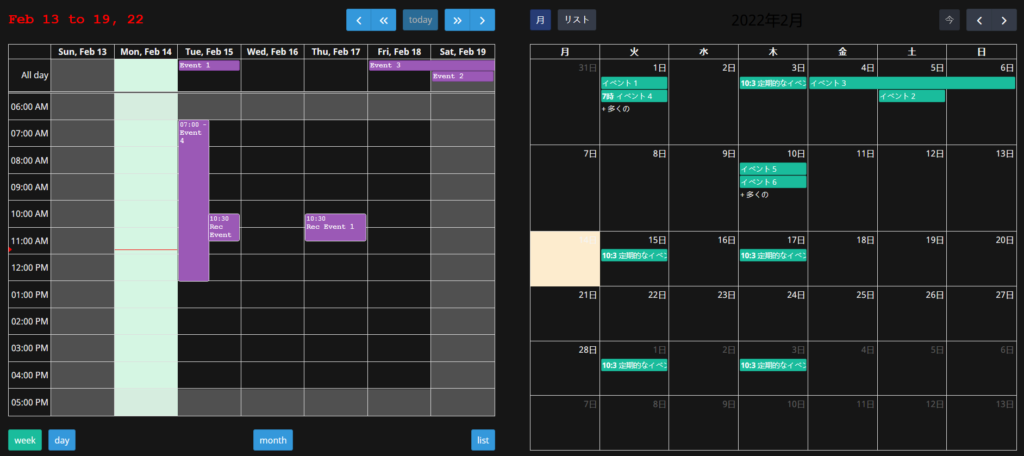
Component Images
Light Mode
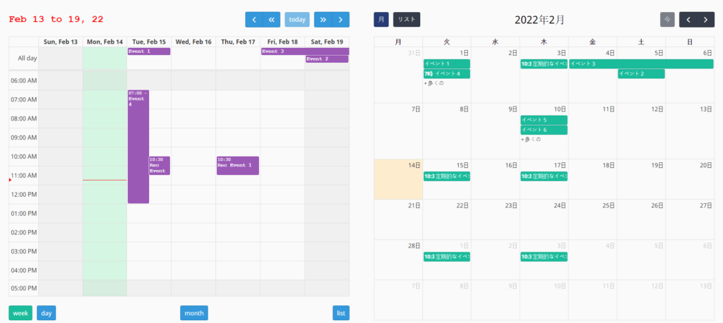
Dark Mode