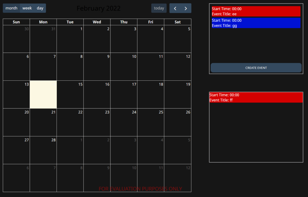
External Event Box
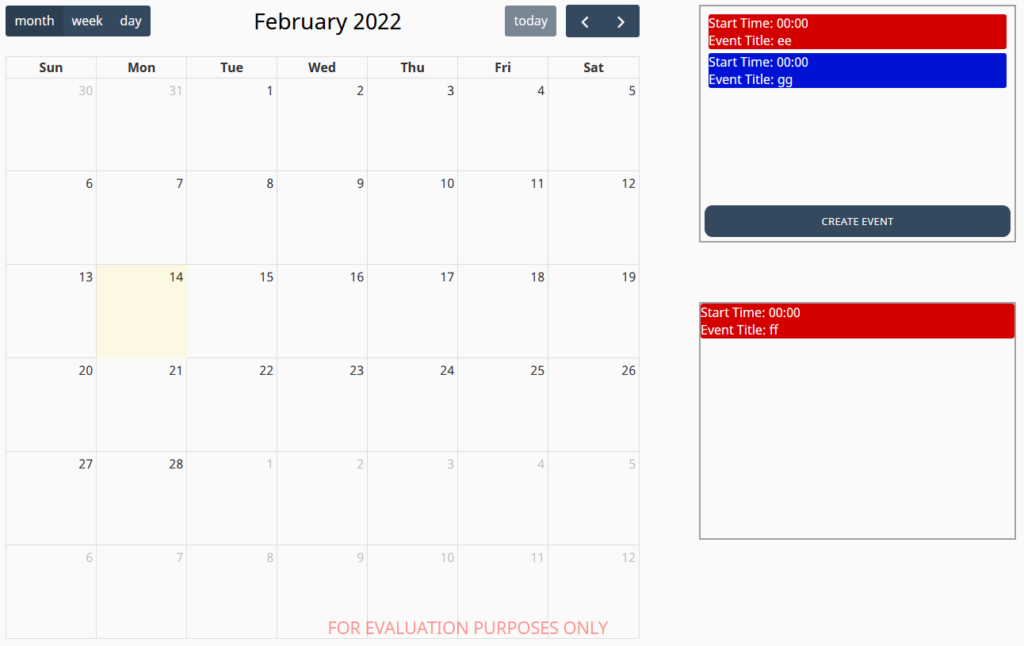
The External Event Box is a container component that holds a list of events which can be dragged and dropped onto a Calendar component. When an event is dropped onto the calendar, the calendar's onEventReceived event fires with the event's details.
The component includes an optional button for creating new events using a built-in event creation popup. Events in the box can be styled individually or given component-level defaults.
Properties
| Name | Description | Property Type |
|---|---|---|
| events | An array of event objects to display in the box. Only title is required — all other properties are optional. See Event Object Properties below. | array |
| eventColor | The default background and border color for events in the box. | string |
| eventTextColor | The default text color for events in the box. | string |
| showCreateButton | Whether to display the button for creating new events using the built-in event creation popup. | boolean |
| buttonStyle | Controls the color and text styling of the create event button for its default and hover states. | object |
| flex | Exposes flex properties for the internal flexbox container that holds the events. | object |
Event Object Properties
Each item in the events array supports the following properties. Only title is required.
| Name | Description | Property Type |
|---|---|---|
| title | The title of the event. Required. | string |
| eventColor | The border and background color of this event. Overrides the component-level eventColor. | string |
| eventTextColor | The text color of this event. Overrides the component-level eventTextColor. | string |
| startTime | The default start time applied when the event is dropped onto the calendar, as a string in HH:mm:ss format. | string |
| duration | The default duration applied when the event is dropped onto the calendar, as a string in HH:mm:ss format. | string |
Component Images
Light Mode
Dark Mode