Downtime
We've provided a ready made downtime analysis page for you in the KanoaOPS project. As with every other part of the kanoaMES application,
this page can be copied and entirely customized to suit your specific needs.
There are many ways to slice and dice downtime data to ascertain the main culprits, so we have provided an array of charts to choose from.
Analysis is ultimately driven by the data, which is why we have focused on ensuring we have the most performant and comprehensive manufacturing
data schema out there. There is no aggregated data; any changes you make to production info, downtime states,
production counts will be immediately reflected in any analysis performed thereafter. The data pulled to display in our downtime charts is the same data
that can be shared with any other system such as PowerBI, Tableau, MathLab via our stored procedures and view tables.
With all that said, let's go over some of the parts of this downtime anaylsis screen.
Filters
We're looking at a lot of downtime data in different ways on this page, so we've limited it to one at asset at a time. You can change that if you like for your application, but for a 30,000ft view of downtime and utilization across all assets within your enterprise, may we recommend the 'Asset Utilization - Reliability KPIs page'.

- Asset Selector: Click on the asset selector
 to choose the desired 'OEE_Enabled' asset (this needs to be a line or cell that we have been collecting data for).
 - Date Range Selector: Select from our pre-defined list of time periods such as 'Today', 'Yesterday', 'Last Week', 'This Month', 'Last Month', 'Year To Date' or select a custom range.
- Duration Filter: Filter out downtimes shorter than a specified duration (in minutes).
- Top Downtime Filter: Limit to just show the top 'N' distinct downtime states or reasons.
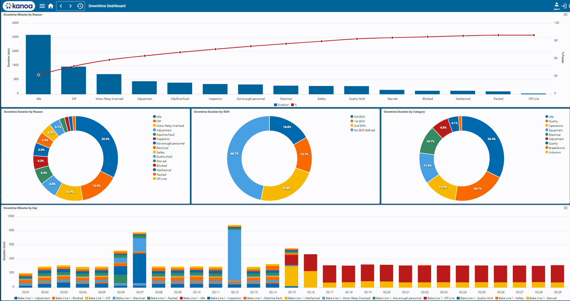
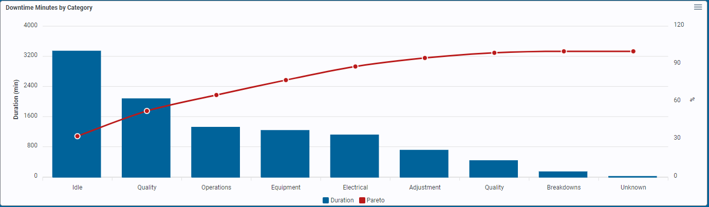
Downtime By Category Chart
Each downtime state can be configured to belong to a certain category. This way you can group certain states to be
say 'maintenance', 'quality', 'equipment', 'personnel' related. figure out which category of downtime affects your operations the most.
The pareto line indicates the 80/20 breakpoint.
Downtime By Reason Chart
All possible reasons (states) why an asset may be down are displayed in this chart. A reason may be unplanned or planned, but ewither way it caused the asset not be running during a production run. Use this chart to identify specifc reasons why your asset sis not producing.
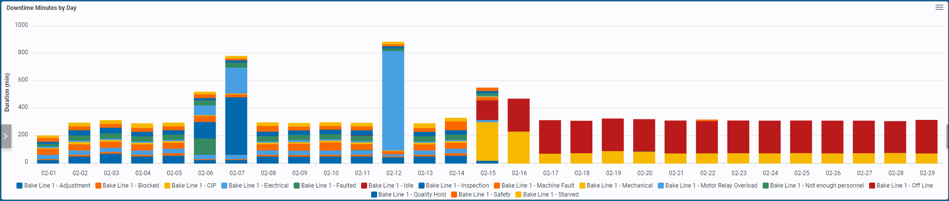
Downtime By Day
Looking for trouble on a particular day? This chart stacks all the different downtime reasons that occurred on each day.
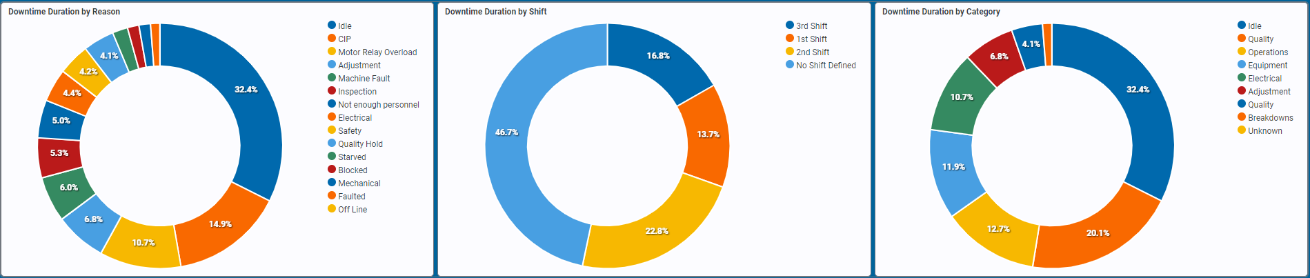
Downtime By Pie
A trio of pie charts show downtime by category and reason in a slightly different way and also throws in a 'Downtime By Shift' pie. If downtime occurred outside of any scheduled shift, it will be thrown into a 'no Shift defined' bucket.
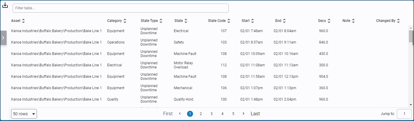
Downtime Table
It doesn't really matter how we organize or display all the downtime, someones going to want to see the data in a different way.
So we've provided a table view of the raw data that can be exported ![]() and thrown into Excel. Pivot away!
and thrown into Excel. Pivot away!