Measures
The Measures feature allows you to capture, aggregate, and statistically analyze process measurements at scale. Rather than storing every raw sample, measurements are collected over a configurable window — by count or by duration — and summarized into a single database record that preserves key statistical properties.
How It Works
A measure is backed by a Tag UDT that collects incoming values in memory. Once the configured window is complete, the UDT computes a statistical summary and writes one aggregated record to the database.
Collection Window
You configure the window in one of two ways:
| Mode | Description |
|---|---|
| Sample count | Collect exactly N values, then aggregate |
| Duration | Collect all values over a time period (e.g. 5 minutes), then aggregate |
Aggregated Output
Each record written to the database includes:
| Field | Description |
|---|---|
mean | Average of all samples in the window |
stdDev | Standard deviation |
min / max | Observed range |
sampleCount | Number of raw values collected |
ucl / lcl | Upper/lower control limits (3-sigma) |
usl / lsl | Spec limits (if configured) |
outOfControl | Whether any SPC rules were violated |
Use Cases
High-Frequency Sensors
A vibration or temperature sensor sampling at 100 Hz would generate millions of rows per day if stored raw. With a count-based window of 500 samples, storage is reduced 500× while retaining the statistical shape of the signal.
Shift or Batch Summaries
Use a duration-based window aligned to your shift length (e.g. 8 hours). Each shift produces one measure record capturing the process behavior for that period — suitable for OEE dashboards and trend reporting.
SPC Without Raw Data Retention
The UDT computes control limits on the collected window before writing. This means you get UCL/LCL and violation flags in the database record without needing to store or re-query the raw samples later.
Centerlining
Measures can be linked to a quality attribute (attributeId) from the attribute specification table. This allows a measure record to be compared against a golden-run baseline, supporting centerlining workflows where you want to know how far the current window deviates from optimal settings.
Multi-Asset Rollups
Deploy the same UDT across many assets. Because each record includes sampleCount, downstream aggregation (e.g. plant-wide averages) can be properly weighted rather than treating each window as a single data point.
Creating a Measure Definition
Measures can be defined in the Configuration/Ops/Measures page as well as via the measures api's.
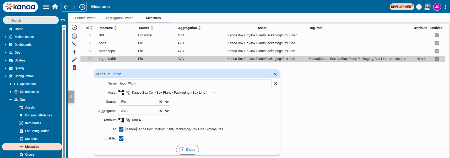
Measures require a name and an asset to be linked with. Data sources for where the measurement comes from i.e. PLC, can be configured and linked. Aggregations can also be defined and linked to determine whether the measurement is an average value, sum etc.
If SPC analysis is required to be performed on the measurement (requires a quality license), an attribute containing spec limits can be linked to the measurement. This enables centerlining comparisons in downstream reporting.
Creating the Measures Tag
By enabling the 'Tag' checkbox, a measure UDT instance will be created in a measures tag folder under the asset. This provides the ability to connect the data source to the measurement value tag.
The Measure tag UDT instance has the following settings:
| Parameter | Type | Description |
|---|---|---|
measureId | int | ID returned by the addMeasure() function |
maxSampleCount | int | # of measurement to collect before storing the measurement |
maxSampleDurationSecs | int | # of seconds between samples before storing the measurement |
outOfControl | bool | Indicator that spc has detected an out-of-control condition |
ruleViolations | array | List of rule violations |
spcCheckEnabled | bool | Set to true to enable SPC check |
enabled | bool | Set to true to enable this measure |
update | bool | Set to true to store this measurement value ibn the database. This is automatically enabled when either the 'maxSampleCount' or 'maxSampleDurationSecs' threshold is reached |
value | float | This is the measurement value. Wire the UDT's value input to the tag you want to measure. The UDT will begin collecting values immediately when enabled is true. |
data | dataset | Measurement values are stored in this dataset and analyzed prior to being written to the database |
spec | folder | Contains measure specification if applicable |
spec/attributeId | int | Id of the attribute linked to this measure |
spec/itemId | int | Id of the item currently linked with this measure |
spec/refresh | int | Updates the specification based on the attributeId, itemId, and assetId |
spec/lsl | int | Attribute spec lower spec limit |
spec/lcl | int | Attribute spec lower control limit |
spec/tgt | int | Attribute spec target |
spec/ucl | int | Attribute spec upper control limit |
spec/usl | int | Attribute spec upper spec limit |
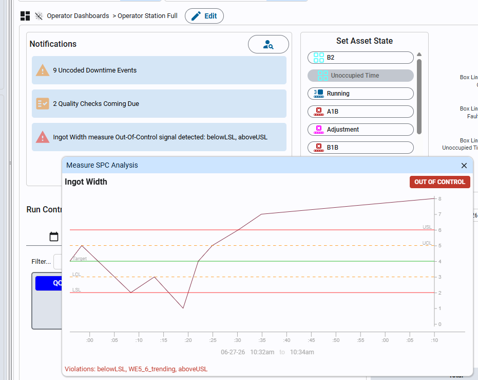
SPC Rules
SPC analysis is run on the collected window before each record is written. You can configure which rule set to apply.
Rule Sets
| Value | Description |
|---|---|
'western_electric' | Western Electric rules only |
'nelson' | Nelson rules only |
'both' | Both rule sets combined (default) |
Western Electric Rules
| Rule | Description |
|---|---|
WE1 | 1 point beyond 3σ |
WE2 | 2 of 3 consecutive points beyond 2σ on the same side |
WE3 | 4 of 5 consecutive points beyond 1σ on the same side |
WE4 | 8 consecutive points on the same side of the mean |
WE5 | 6 consecutive points trending in one direction |
WE6 | 15 consecutive points within 1σ of the mean |
Nelson Rules
| Rule | Description |
|---|---|
N1 | 1 point beyond 3σ |
N2 | 9 consecutive points on the same side of the mean |
N3 | 6 consecutive points trending in one direction |
N4 | 14 consecutive points alternating up/down |
N5 | 2 of 3 consecutive points beyond 2σ on the same side |
N6 | 4 of 5 consecutive points beyond 1σ on the same side |
N7 | 15 consecutive points within 1σ of the mean |
N8 | 8 consecutive points with none within 1σ of the mean |
Chart Types
| Value | Description |
|---|---|
individuals | Individuals/moving range chart. Used when each measurement is a single value. Default. |
xbar | X-bar/range chart. Used when measurements are grouped into subgroups of 2–10 samples. Requires subgroupSize. |
Use individuals for most sensor and manual entry scenarios. Use xbar when your process naturally produces batches of samples (e.g. 5 parts per cycle) and you want to track subgroup means.
Measures Analysis
The Measures Analysis view provides a multi-chart breakdown of aggregated measure data over a selected time range. It is designed to surface trends, distribution patterns, hourly variation, and sample count anomalies in a single screen.
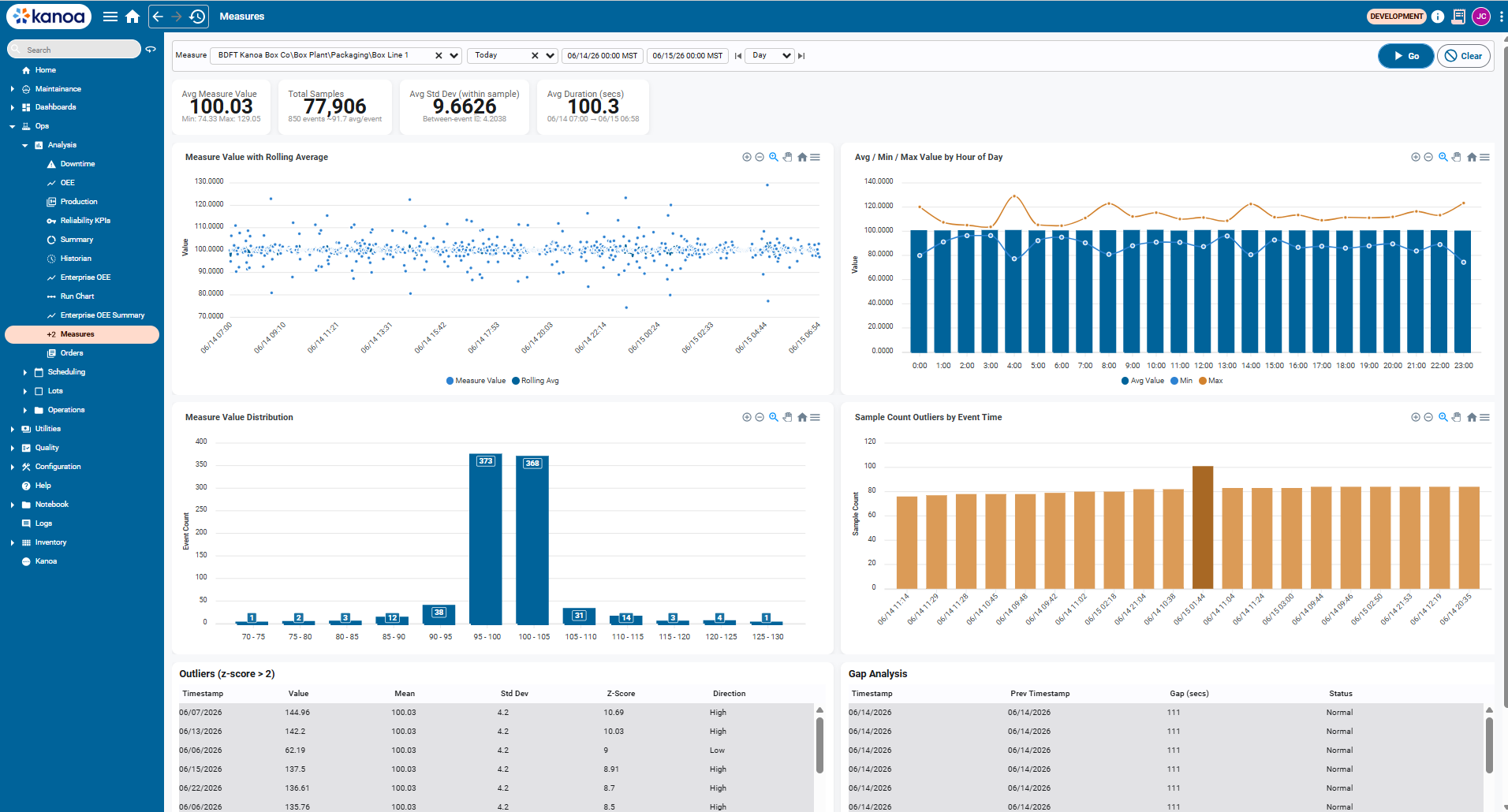
Filters
| Filter | Description |
|---|---|
| Measure | Asset-scoped measure to analyse (e.g. BDFT Kanoa Box Co\Box Plant\Packaging\Box Line 1) |
| Date range | Preset (Last Week, Last Month, etc.) or custom start/end timestamps |
| Granularity | Day / Shift / Hour — controls how rolling averages and hourly charts are bucketed |
Click Go to apply filters. Click Clear to reset to defaults.
KPI Summary Cards
Four summary cards appear at the top of the view.
| Card | Description |
|---|---|
| Avg Measure Value | Mean of all aggregated values in the selected range. Min and Max show the observed extremes across all events. |
| Total Samples | Sum of sampleCount across all events. Also shows total event count and average samples per event. |
| Avg Std Dev (within sample) | Average of the per-event standard deviation. Reflects within-window process variation. The between-event figure shows variation across events. |
| Avg Duration (secs) | Average collection window duration in seconds, with the full date span of the query shown beneath. |
Example
From the screenshot above (06/14/26 – 06/21/26, Box Line 1):
- 100.02 avg value across 532,439 total samples (5,932 events, ~89.8 samples/event)
- 8.9647 avg within-sample std dev, with a between-event std dev of 3.6711
- 100.6 s avg window duration
Charts
Measure Value with Rolling Average
A time-series scatter plot of every aggregated event value over the selected range. A rolling average line is overlaid to show the process trend.
Use this chart to:
- Identify drift or step changes in the process mean over time
- Spot isolated outlier events against the rolling trend
- Confirm process stability across shifts or days
Avg / Min / Max Value by Hour of Day
A bar + line combo chart grouping all events by hour of day (0:00–23:00). Bars show the average value per hour; lines show the min and max observed in that hour across the full date range.
Use this chart to:
- Detect time-of-day patterns (e.g. startup variation, shift changeover effects)
- Identify hours where the max consistently exceeds spec
- Compare average vs. worst-case behaviour by hour
Measure Value Distribution
A histogram bucketing all events by their aggregated value. Each bar shows the event count falling within that value range (e.g. 95–100, 100–105).
Use this chart to:
- Confirm the process is centred on the target value
- Identify skew or bimodal distributions that suggest a mixed process
- Quickly see how many events fall outside expected ranges
Sample Count Outliers by Event Time
A bar chart of sampleCount per event over time. Events where the sample count deviates significantly from the typical range are visually prominent as outliers.
Use this chart to:
- Identify events where the collection window captured an abnormal number of samples (sensor bursts, window timing issues)
- Spot gaps where sample counts drop unexpectedly (e.g. downtime, tag disconnection)
- Validate that window configuration is behaving consistently
A sudden spike in sample count (as visible in the example above around 06/16–06/17) can indicate a window that failed to flush on time and accumulated extra samples before writing. Cross-reference with the rolling average chart to see whether the value was also affected.
Outliers (z-score > 2)
A paginated table listing every event where the aggregated value deviated more than 2 standard deviations from the process mean.
| Column | Description |
|---|---|
| Timestamp | Date/time of the event |
| Value | Aggregated measure value for that event |
| Mean | Process mean across the selected range |
| Std Dev | Process standard deviation across the selected range |
| Z-Score | How many standard deviations the value is from the mean |
| Direction | High — value above the mean, Low — value below the mean |
Rows are sorted by Z-Score descending, so the most extreme outliers appear first. Rows highlighted in orange indicate events that also exceeded the USL or LSL.
Use this table to:
- Identify the most extreme process excursions and when they occurred
- Distinguish high-side from low-side outliers
- Drill into specific dates for root cause investigation
Gap Analysis
A paginated table showing the time gap between consecutive events, flagging windows where the gap was larger than expected.
| Column | Description |
|---|---|
| Timestamp | Date/time of the current event |
| Prev Timestamp | Date/time of the preceding event |
| Gap (secs) | Elapsed time between the two events |
| Status | Normal — gap within expected range, Large Gap — gap significantly exceeds the typical window duration |
Use this table to:
- Detect periods where measurement collection stopped or stalled (downtime, tag disconnection, network issues)
- Validate that the collection window is flushing consistently
- Identify missing data before using the analysis for reporting or compliance
A Large Gap alongside a spike in the Sample Count Outliers chart on the same date often indicates the window paused and then flushed a backlog of samples in a single event when collection resumed.
Real-time SPC Alerts
The notifications widgets will display any out-of-control conditions for measures that have spcCheckEnabled' set to True. this can be used to immediately alert operators on a line to any out-of-control conditions.